

The Full breakdown: My Wedding Calligraphy Project
10 years on, I am spilling the tea on the calligraphy elements that I created for my wedding in May 2016, how I made them, and my honest critique of the results.
Would I do things differently if I had my time back? Read on to find out…
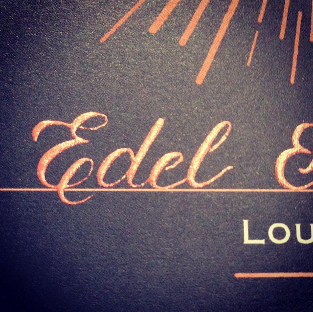
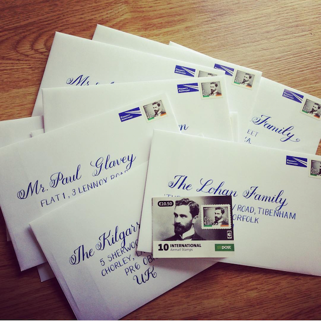
Invitations and envelopes
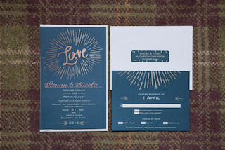
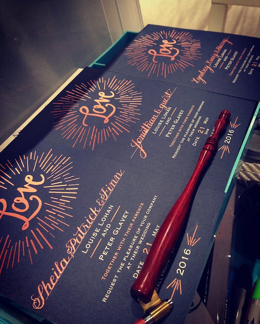
Effort: 9/10. This job took many hours of practice with dip-pen and ink, lots of drills, and a lot of study and practice with mixing ink. It was a big effort to develop the technique, so that I could achieve really formal and elegant-looking calligraphy. However, because I started on the invitations and envelopes first, that really set me up to take on the other projects with much more confidence. I’d give this a 10/10 for effort, but the process of learning was so enjoyable, I’m knocking a point off for that.
Calligraphy method: Oblique dip-pen with Nikko G nib. Ink for envelopes was a calligraphy gouache by Schminke in a shade called Paris Blue. And ink for the invitations was Rose Gold Pearl-ex.
My honest critique: Two thumbs up! I was so pleased with how both the invitations and envelopes turned out. The invitations only required names to be written in the space provided, while the envelopes were a bigger challenge trying to figure out the correct layout and how to centre the text (see my related blog post on Calligraphy for Envelopes). I was so excited to send these in the post and I wouldn’t change a thing!
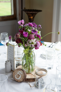
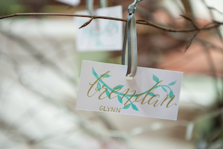
Place cards
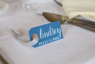
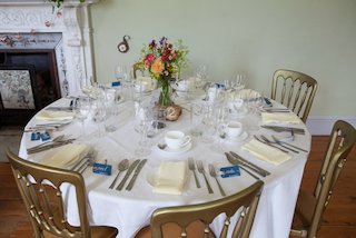
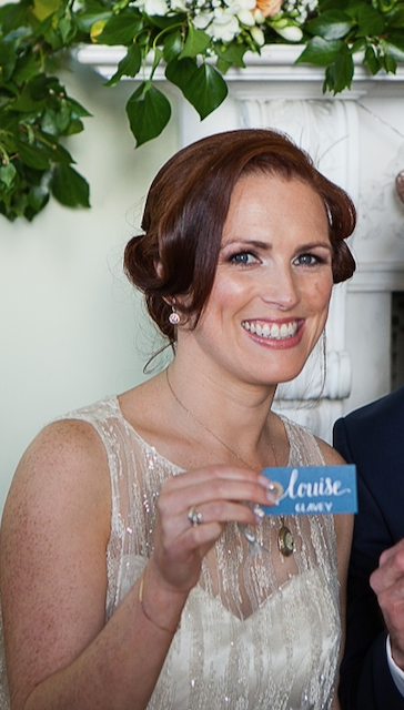
Effort: 7/10.
Calligraphy method: Oblique dip-pen with Nikko G nib and ink in Bleedproof White by Dr Ph Martins. I bought the blue name tag cards while on a trip to Stockholm - they were quite simple with the hole already punched and easy to dress up with a ribbon.
My honest critique: I really liked these place cards. They were not very labour-intensive, I kept the lettering of the surname to simple block letters, and I thought they looked really pretty on the dining tables.
Monogram
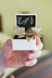
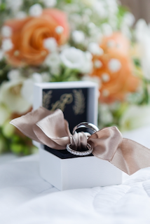
Effort: 5/10.
Calligraphy method: Faux calligraphy with a gold gel pen on a black card insert. I designed the monogram on a practice pad first, figuring out how I wanted our initials to intertwine. Then, I measured the size of the interior of the box, cut a piece of card to size, and used the gel pen to create the monogram. I added some foliage as a decorative embellishment, et voilà!
My honest critique: Happy with this little detail - I think it makes the ring box look extra special and personalised. And faux calligraphy couldn’t be easier.
Table numbers
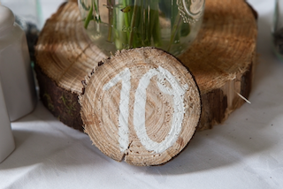
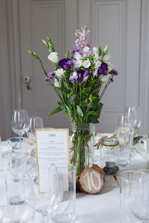

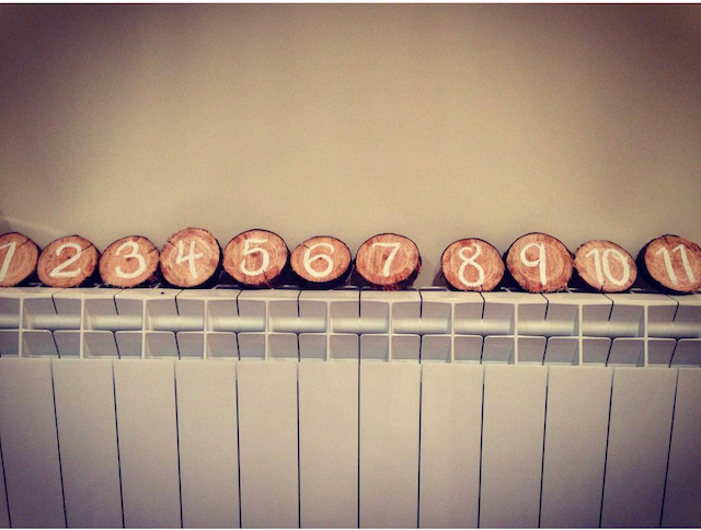
Effort: 4/10.
Calligraphy method: Faux calligraphy with white paint on roughly-cut wood slices. I was keen to use a bit of natural material in the table design, to give a bit of a bring-the-outdoors-indoors feel, so I asked family members to provide the wood slices from their own supply and the numbers took no time to paint on with a brush.
My honest critique: If I had my time again, I’d maybe sand down the surface I was lettering on to make it smoother, but I wasn’t interested in spending tons of time on these. I had other calligraphy I wanted to do! I was happy with the end result - I thought it looked rustic and cute.
Hanger labels
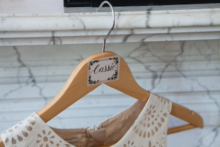
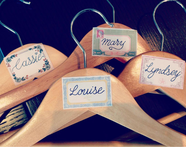
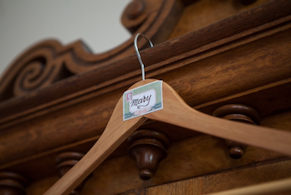
Effort: 3/10.
Calligraphy method: I had originally wanted to have white calligraphy on the the wood surface of these hangers, but I couldn’t make it work due to the lacquer on the wood. So, I compromised by using some stickers that I had found in a stationery shop in Stockholm (brand was Chronicle Books). and using faux calligraphy with a black fineliner pen.
My honest critique: The second photo shows the lettering before I applied some thicker shading to the downstrokes (a technique known as monoline calligraphy), which I did like - but was happier with the final effect; the contrast of thick and thin lines, just like the effect a dip-pen would have.
Cake Topper
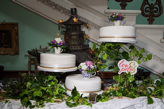
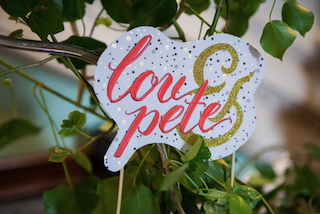
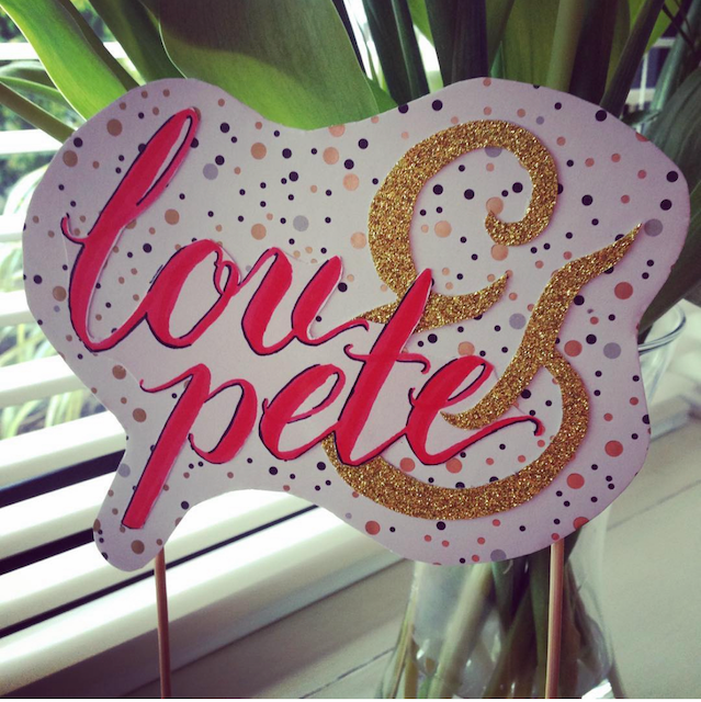
Effort: 4/10.
Calligraphy method: I used Tombow brush pens on a piece of white card to do the names, then added the ampersand in a gold glitter card (sketched and cut out). I mounted both on some spotty design card and attached wooden skewers to the back so that it could be inserted into the cake.
My honest critique: Not so happy with this one, if I’m being honest. While I was trying to incorporate the raspberry red of my bridesmaid’s dress and the gold of my champagne-coloured wedding dress, I feel that this final design looks a bit ‘crafty’ and not as refined as some of the other calligraphy pieces I created. Still glad I tried it out, but if I hadn’t been in such a time-crunch towards the end, I would have done something more elegant with a dip-pen.
Remembrance Tree
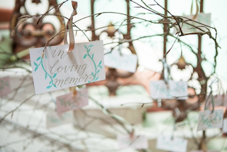
Effort: 5/10.
Calligraphy method: Faux calligraphy with a gold gel pen on light pink cards, stamped with a green leaf embellishment. These cards were easy to make. I used a hole punch to make a hole for a ribbon, so they could be hung on our remembrance tree. A thoughtful addition to our wedding reception.
My honest critique: I was happy with how these turned out, the faux calligraphy looked good. If I’d had more time (and fewer projects, lol) I would have gone with dip-pen with gold ink instead. The gel pen doesn’t stand out or shine quite as beautifully as Finetec gold watercolour ink!
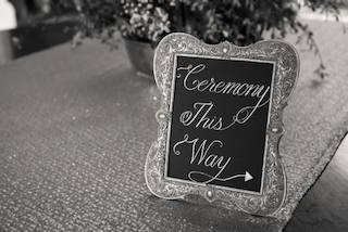
Outdoor signage

Effort: 6/10.
Calligraphy method: Faux calligraphy with white chalk paint marker on chalk board. The sandwich board was purchased on Donedeal for 50 euro and I sold it after the wedding for 45, so this project cost me nothing, really. Most of the work for this was painting over the sides of the board to change it from a green metallic paint to white.
My honest critique: A word of advice: Don’t leave it to the morning of your wedding to letter your wedding sign! I really rushed this sign, which is probably obvious from the unbalanced and wonky lettering! Not thrilled with the result, but I think it turned out fine.
Indoor signage
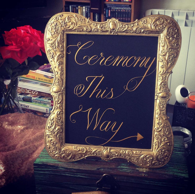
Effort: 7/10.
Calligraphy method: Oblique dip-pen with Brause Steno (blue pumpkin) nib, with gold Finetec ink on black card. The antique-style golden frame was borrowed from a family member and the gold ink matched it beautifully.
My honest critique: I still absolutely love this piece - it’s one of my favourite elements from our wedding. It took a bit of planning and mocking up in pencil to figure out the size of the lettering that I wanted and how the capitals and flourishes would fit this size of frame, but I was thrilled with how it turned out.
Would you try any of these for your wedding?
I’d love to hear from you if you would.
Anyway, I hope this was helpful. Feel free to get in touch if you’d like to learn more about any of these elements, tools, or techniques.
And you can download my free Fabulous Faux Calligraphy guide to try the easiest calligraphy technique for yourself.
Le grá (with love),
Louise x
Credits
Venue: Temple House, Ballymote, Co. Sligo
Photographer: Dee Organ Photography
Make-up Artist: Ann Young Make-up